How to Use Color To Make Your Vintage Home Reflect Its History

Paying particular attention to the color palette is an important element in preserving your home’s architectural integrity.

tarry town
(Image via homeaway.com)

BeachSide WhiteRock
(Image via BeachSide WhiteRock)

Restoring a historical home is an act of love. One of the ways to show your love is to ensure that your vintage home remodel resonates with the time period in which it was built. Paying particular attention to the color palette is an important element in preserving your home’s architectural integrity — it helps your home tell its story.  

1900s
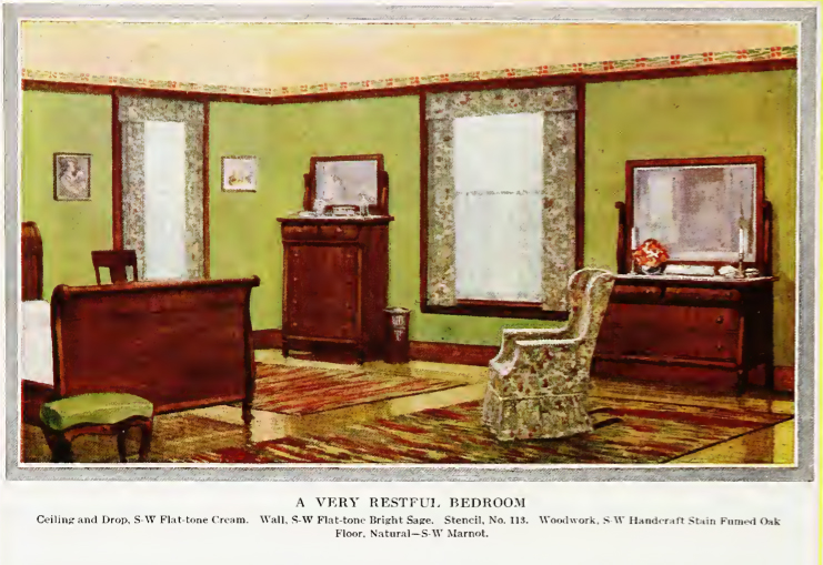
Turn of the century American architecture, influenced by the English Arts and Crafts movement, is characterized by a reaction against the mass production of the industrial revolution. Frank Lloyd Wright’s “organic” architecture came to define this era, together with the Craftsman style.

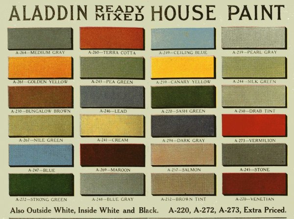
The color palette of the time — subdued, soft and neutral — was intended to create a calming atmosphere removed from the industrial hustle and bustle of the oncoming modern age. For an interior evocative of the first decade of the 20th century, use colors such as pale salmon pinks, warm ivories, rusty light oranges, and soft greens.

living room1900
The soft ivories and warm orange accent pillows allow the crown molding and the fireplace tile work to stand out. (Image via Mark Lohman – This Old House)

1910s
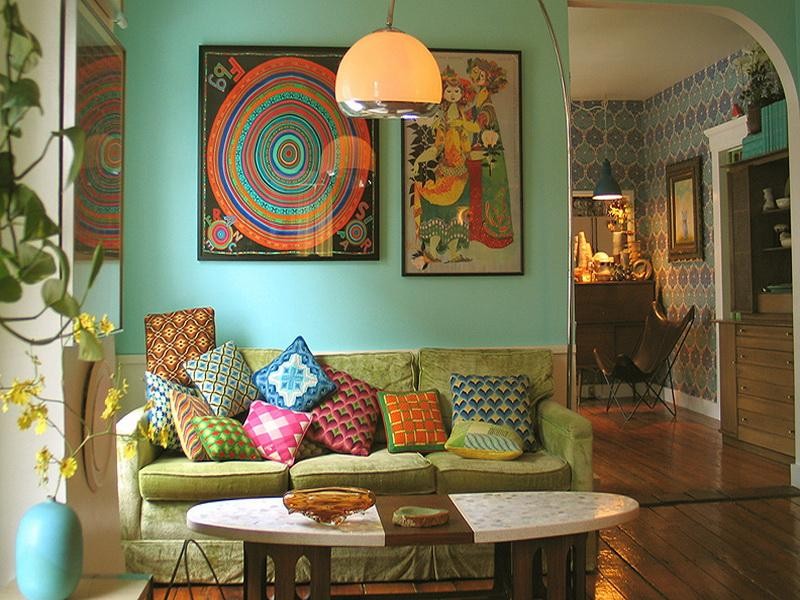
This was a time of upheaval; the horror of World War I, the fight for suffrage. The color palette of this decade tended toward the dramatic, bold and saturated: deep pomegranate, dark purple, medium greens and blue-grays became prevalent and represented a break from the soft muted colors of previous decade.

Old House Online
The blue-green of the fireplace tile complements the warm browns of the wood and the rich burgundy of the leather furniture. (Image via oldhouseonline.com)
Aladdin Color Palette
To paint your home in a style resonating with the 1910-1920s, consult this color palette.
1912 bungalow
A stencil from an interior design periodical printed in 1912: the bright sage greens and the burgundy elements reinforce the strong color themes of this decade. (Image via 1912 “Home Building and Decoration” by Henry Collins Brown.)

1920s
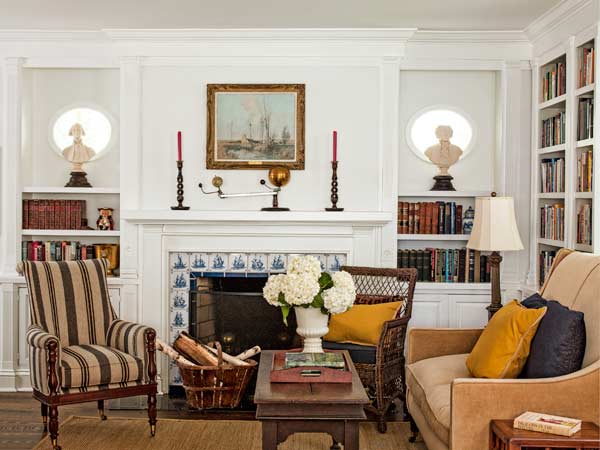
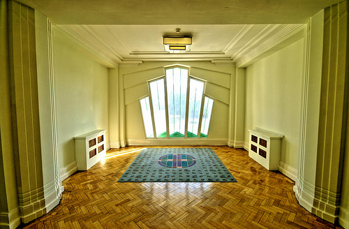
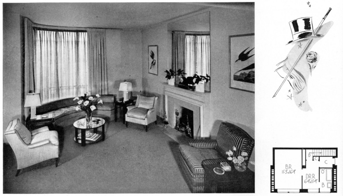
In the roaring 20s, skirts were shorter and hair was bobbed. Art Deco designs and architectural style define this decade: geometric windows, elaborate floor marquetry, neutral, pale tinted cream walls allow the architecture to take center stage.

Art Deco
This 1920’s home showcases the Art Deco sensibilities of the decade. (Image via Heavenly Homes)
1920s contemporary
Contemporary interior design in a Tudor style home makes good use of the neutral, tinted color scheme. The bright abstract artwork serves as a focal point.
1920s
This home is a beautiful example of “Gatsby Era” design: clean angular lines, muted light colors embody elegance and sophistication. (Image via thebeautifulshuttercompany.com)

1930
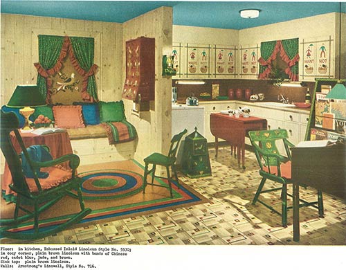
The Great Depression of 1929 eradicated the joie de vivre of the roaring 20s. Frank Lloyd Wright built his famed Falling Water and colorful “Depression Glass,” was distributed free or at low cost, to make consumer goods appear more aesthetically pleasing. The colors dominating interior design at this time were jade, celadon, pale gold, grassy tans, pale silvered almond, and walnut brown.

Well mannered
In this small family home built in the 1930s, the Art Deco aesthetic has given way to a simpler style with fewer decorations. (Image via designingtomorrow.com)
1930s Living Room
This contemporary interior stays true to the 1930s time period: the interior is comfortable, but not fussy. The color is pale almond and white, creating a calming atmosphere.
Avon Road
This interior treatment of a 1930s home uses neutral and warm grays throughout to create a unified look, while the yellow throw pillows and fresh flowers add pops of color. (Image via homefresh.com)

1940s
At the beginning of the decade, with the onset of World War II, American industry geared up and Rosie the Riveter became the icon of American women in the war effort. The color palette went back to bold with saturated reds, warm oranges, strong teals and greens reminiscent of the color scheme of the WWI era.

1940s Kitchen
A catalog page from the 1940s shows the new trend of Americana: linoleum floors, ruffled drapes, and saturated colors. (Image via retrorenovation.com)
1940s living room
A contemporary living room in a 1940s home faithfully recreates the period look with a bright green throw rug and patterned wallpaper. (Image via theinteriorsaddict.com)
tarry town
This 1940s Bungalow has been updated with rustic accents and modern touches, but the bold yellow is a nod to the period this home was built in. (Image via homeaway.com)